
As a rookie copywriter, I would show my work to the CD and he would often say “It’s OK, rookie copywriter, but it needs more yous in it.”
The received wisdom at the time was that the frequent use of ‘you’ would help convince the reader that what they were reading was actually about them; that the advertiser had their needs and interests at heart.
Now it’s all us us us
There seems to have been a bit of a shift in recent years, away from ‘what can we do for YOU?’ to ‘This is us. OK?’.
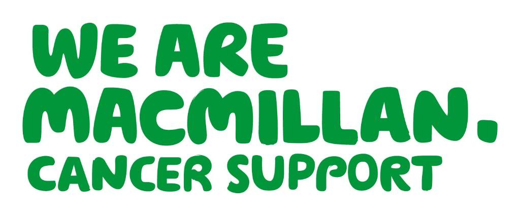
The first use of this I came across was Macmillan, the charity that supports people living with cancer.
Any problems with that?
It’s bold. It’s friendly. It’s green. Mostly, it’s giving a personality to a previously stuffy-sounding charity. Written out in full it would say “We do everything from changing your sheets to lobbying the government. We do this for you because we are Macmillan and it’s what we do.”
Good line. We’ll take it

But what’s this? It seems we are no longer just Macmillan. We are now some wine company, too.
There’s less of the sense of the friendly greeting in Blason’s line. It’s a bit more shouty. Written out in full it would be: “Pissed, are you? Grinning like a frog? That’s down to us, that is. We made you that way. We are nice to drink. We are addictive. WE ARE BLASON! GRRR!”
Incidentally, notice how both Blason and Macmillan have full points after their names? Bad practice, according to long-dead ad guru David Ogilvy. And surprising in Macmillan’s case. Their logo was created by a design agency, and design agencies are generally virulently opposed to punctuation.
That’s another blog, though.
We’re all it it
The age-old bank (and before that, building society) Abbey (and before that, Abbey National) has recently changed its name to Santander. Just why is far too dull to go into, and in any case I don’t know, but they too have gone down the ‘we are’ route for their new brand:

Are you? I’m so happy for you.
Nothing about what we can expect from this new company, with their dual typefaces and mystifying logo. The Macmillan friendliness is completely absent. If anything, ‘We are Santander’ sounds a bit table-thumping.
We are not just soaps and quizzes. Honest
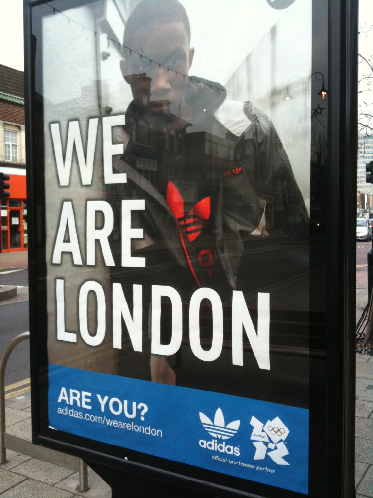
Next up is ITV1, who evidently are now football united.

Of course you are, dearie
They have some screen idents that explain this claim in more detail. Next time it’s on I’ll pay more attention, but it looks like it means ITV1 will show some of this season’s Champions League matches. Bully for them.

We are not Stoke Poges
Apparently, we they are a ‘leading usability research, interactive design and accessibility agency, with strategic consultancy expertise and training services’. Nothing very Londony about that. Anyone quizzing them for the name of the best sushi bar in Shoreditch is probably better off looking elsewhere.
News just in! ‘We are London’ has a rival. I know who my money’s on:

Are we not men? Definitely not. We are photogirls.
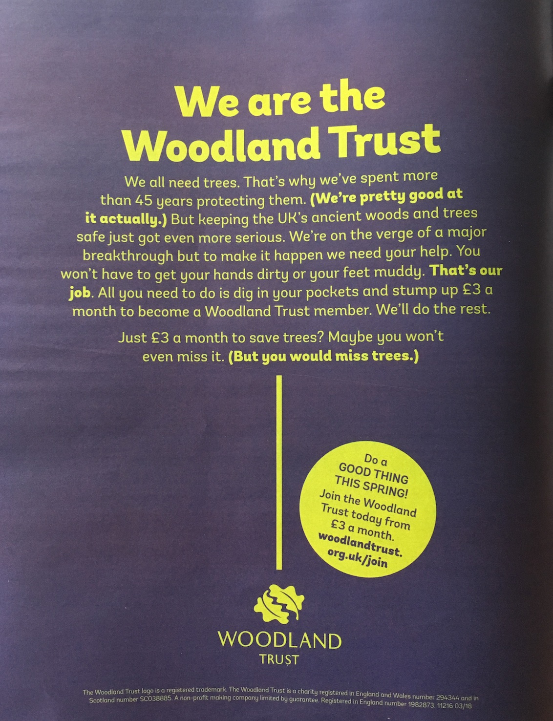
A new addition to the list: The Woodland Trust. As to why their agency felt that a big logo wasn’t enough to tell readers the name of the advertiser we can only guess. And why they allowed that yellow blob to undermine the tree idea is another mystery. I’m also stuck on the random brackets. But anyway. We are…
And on to the rest:


Perhaps the worst rebranding ever.

