
We are deep into the 1980s and advertising agency de jour Collett Dickenson Pearce (CDP) has just presented its solution to the latest brief from its client, Parker Pens. Like previous executions in a long-running campaign, the ad takes the form a 48-sheet poster.
This ad features a pen that, unusually in an era of shiny silver and gold pens, is finished in matt black.

The poster ticks all the right boxes. Just seven words, lots of standout, nice pack shot, and a headline that completely wrong-foots the reader. You’re expecting it to say ‘clever’ or ‘smart’ or ‘gorgeous’; anything but ‘dull’. By confounding our expectations, the ad encourages you to look at the image, reread the headline, complete the equation ‘dull = not shiny’, then study the caption and make a mental note to try the pen out next time you’re in Smiths. Job done.
The client loved the ad and ran it. It picked up a few awards and probably shifted loads of pens.
The following is what could have happened had the Parker client been one of those people who likes to ‘improve’ ads.
And what could have happened had the agency been one of those that doesn’t stick to its guns…
“I like it,” says the client, ‘but I’ve seen research stating that people don’t like negatives in ads. Can we turn the headline round and make it a bit more positive?”
“Sure”, says the account director. “I’ll get the creatives straight onto it.”

“Much better,” says the client. “Very strong. But I’ve been discussing the ad with my team and some very good points were raised.
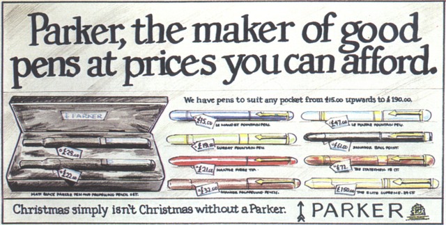
“The advert doesn’t make any mention of price. The pen you’ve chosen is quite expensive, so I was wondering if the ad could reflect the fact that Parker make a range of pens. You know, to suit every budget. We don’t want people to think we only make pricey pens!
“Also, and this is probably my mistake, I neglected to mention the matching presentation case the Parker 25 set actually comes in. And the guys in Brand went ape about the lack of a logo! Can you add the logo, and our Royal Warrant?
“Oh, and we’re in October now. People will be thinking about Christmas. Could you just add a nudge in that direction? Thanks”
“No problem,” says the account director.
“Brilliant! You guys rock. And that’s so true, about Christmas and Parker. Well done.
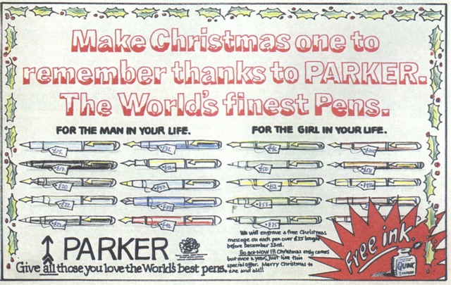
“You know, I was wondering if we could perhaps capitalise on that whole Christmas giving thing? I only ask because Parker offers an engraving service. That would be such a neat idea at this time of year. Plus I went on this advertising course where they kept going on about how the ‘offer is king’. So let’s just push this engraving idea, shall we?
“Otherwise it’s fine. Although we could perhaps big up Parker a bit. They don’t throw out these royal warrants willy-nilly, you know. We shouldn’t undersell ourselves.”
“Of course not,” says the account man. “I’ll see what the studio boys can rustle up.”

“Perfect. Looks like you’ve got everything in there.”
*reads for several minutes*
“Good. Very good. Although…”
“Yes?”
“Well, I showed the previous ad to Mrs Client, and she pointed out that it didn’t really shout ‘Christmas’ enough. Could you just make this one a tad more seasonal, do you think? Then we’re just about there, I reckon.
“Oh, and following on from that ‘the offer is always king’ thing I was telling you about, I had a bit of a brainwave about how we could drive sales by offering another of our products at the same time. It’s all about driving sales at the end of the day, isn’t it?”
“Ha ha ha, of course it is. I’ll ask the studio…”
“And the pens look a bit all over the place. It’s not immediately apparent who they’re aimed at. Could you group them according to whether they’re male or female pens?”
“A fantastic suggestion! I’m on the case.”
“We’re getting there. We’re certainly getting there.”
“That’s great news. I’ll…”
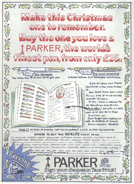
“Although, looking at it, there is rather a lot to take in, isn’t there?”
“Eh?”
“For a poster. Aren’t they supposed to have a maximum of eight words or something? That’s what you told me, I distinctly remember. You’re ignoring your own advice!”
“But…”
“Don’t worry. I have a solution. Instead of a poster, make it a press ad. That way you can get in a few more sales points. And a list of dealers. I know! Duh! Let’s make it a direct response ad and sell pens off the page! You know, I think we’re going to end up with something really quite different.”
“Yes, I think you might be right.”
“Brilliant! Anyway, must dash. I’ve heard a rumour that our share price is slipping…”
About this article
I found this piece in a very old edition of Creative Review. Although when I found it, it was called ‘the latest edition of Creative Review’.
I kept the magazine because I thought the piece was a funny and telling demonstration of many truths. How ideas are precious things, how the desire to ‘improve’ an idea is part of many people’s make-up, and how a willingness to please (or appease) a client can result in poorer and less effective work.
I lent the magazine to a creative director who thought it would be good for a talk he was delivering on the subject, and that was the last I saw of it. However, he had kept the visual elements of the piece, and these he kindly emailed to me. Unfortunately I don’t remember the author of the text that originally accompanied the visuals – I think it might have been the ex-CD of CDP, John O’Donnell. I hope my words have maintained the spirit and, hopefully, some of the wit of the original.
Resources
A (relatively recent) history of the Parker Pen Co, Wikipedia’s entry on Collett Dickenson Pearce, and some of their ads
Text © Kevin Mills 2013

