Tag Archives: advertising

How To Do An Advert

A trade ad for lawnmowers

Text:

At STIGA, we don’t just cater for the discerning domestic gardener we have designed and built machines to meet the needs of commercial operators, from contractors and estate managers, through to groundskeepers and professional landscapers. Powerful engines, advanced functions, ergonomics and high quality construction, STIGA machines are built from the ground up.
Established in Sweden in 1934, STIGA has more than 80 years of experience in producing innovative gardening products
To discover the complete range or to find your local STIGA dealer visit: www. stiga.com/uk

The target market
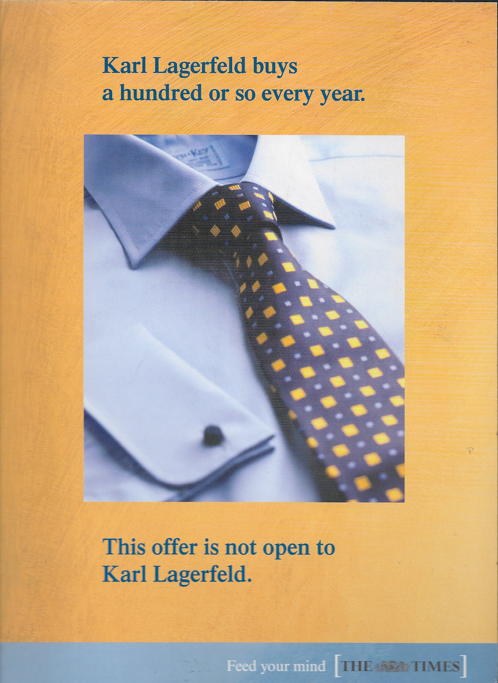
Who are you talking to? Ordinary consumers are one thing; you can be all clever and creative with them. But trade ads are different. If your ad is aimed at professionals, remember these are serious-minded people who don’t appreciate wit or subtlety. They’re also busy all the time so get straight to the point. Tip: why not list all the kinds of people you’re talking to in your copy?

The headline
It should be short, compelling and original. Failing that, the first idea that comes into your head will probably do. If it’s a cliche or a play on words, you can safely ignore that bit about avoiding wit. BUT make sure the reader knows you’ve employed a witticism by adding an exclamation mark.

The image
It could be a single, striking and entirely unexpected picture, something that really leaps off the page. OR, it could be straightforward and mundane. If you opt for the safe and dull route, remember that it needn’t even be a single image. Choose as many as you like. If your pictures have some sort of relationship to your headline all the better, but don’t try too hard. Or at all – it’s completely up to you. For example, the headline here talks about Stiga’s tools cutting EVERYTHING. But a quick look at the pictures shows them cutting grass, grass, grass, grass and some more grass.

The copy
The beginning of the copy is always the hardest part. So why not try something different and start with a negative? Tell the reader what you DON’T do before going on to say what you DO do.

Bear in mind that long opening sentences can draw the reader in. They invariably don’t, I’m just saying they can. As the reader negotiates his way through your four-line, 35-word sentence, remember that punctuation is your friend. But it can also be a right bitch to master. So if you’re unsure where to put a comma or full stop, just leave it out. Even the busiest professional will willingly invest his time in figuring out what you mean.

In an ideal world, your copy should expand on the theme established by the headline. Excuse me, did someone say ideal world?! It’s anything but that right now, so your copy can say anything you like. In the example shown here, the writer hasn’t provided a single example of how the manufacturer refuses to cut corners. (Although, oddly, the only photo of any note shows a STIGA machine doing precisely that.)

Avoid using words like derivative, old-fashioned and awkward. Today’s busy professionals expect to see words like innovative, advanced and ergonomic. No trade ad is complete without them.

Make sure you tell the reader the exact year your company was founded. (Month and day optional.) Then express its age in a slightly different way, to really drill the point home. Your country of origin is important too, especially if it’s hugely relevant to the product you’re advertising. Sweden and lawns? Maybe. No matter, bung it in anyway.

For your call to action, remember to include the www bit of the URL. No one can find anything on the web without it.

The strapline

Right at the start of the copy, it was established that ordinary domestic gardeners weren’t the primary audience for this advertisement. No, it’s the big boys STIGA are talking to here. They’re listed, remember? The groundskeepers and estate managers? So choose a tagline that talks directly to this audience.

Or, forget all that and use one that talks to ordinary domestic gardeners. It’s YOUR ad. You can do what you like.

Leave a comment

Filed under Ill-informed advertising observations

Making a headline from the Ts&Cs

Back in the day I had a brief to write an insert selling Hilditch & Key shirts to readers of The Times.

It was basically a half-price offer. So that could have been my headline. ‘50% off Hilditch & Key shirts.’ That would have worked. But, and this is where brands and how they sound comes in, would it have felt right? Both The Times and Hilditch & Key deserved better, I thought. You can always slap people about the chops with ‘Half-Price Bargain!’ and ‘Save £££s’ type headlines, but this wasn’t the occasion.

So I did some research about Hilditch & Key (a brand I hadn’t previously heard of) and learned that their shirts were popular with big names in the fashion industry. Yves Saint Laurent. Paloma Picasso. Karl Lagerfeld. In fact, I learnt that Lagerfeld was a proper little H&K fanboy, snapping up more than a hundred of their shirts every year. Weirdo. Anyway, I also read the terms and conditions attached to the offer. Don’t you do that? I thought all copywriters did that! No, I only did because of the Karl Lagerfeld thing. Lo and also behold, there it was: a term, or perhaps a condition, stipulating a maximum of two shirts per household. And with it, there was my headline.

Eye-catching, name-dropping, a bit cheeky, an air of exclusivity, and true to the brand values of both The Times and Hilditch & Key. Details of the offer went on the reverse.

Like I say, the insert might conceivably have sold more shirts if the headline had read ‘BUY NOW AND SAVE 50% ON CLASSIC SHIRTS!’, with a couple of flashes, all the copy in Courier, a call to action on every line and a bigger scissors graphic. But sometimes – hell, always – it’s about the brand.

Art Director: Tony Henry

Note: If you squint you might be able to detect a semicolon on the second line. Strictly illegal these days, a semicolon was sometimes used to indicate a pause shorter than a full stop and longer than a comma. What WAS I thinking. 

2 Comments

Filed under Ill-informed advertising observations, Stuff

Not, I’d say

Remember Shreddies’ knitting Nanas? Launched in 2009, the idea was that hundreds of Nanas lovingly knitted each Shreddie to ensure they were all absolutely perfect. The campaign highlighted Shreddies’ unique design and taste. Some found it off-putting (‘yeuch, wet wool touched by olds’) but the campaign was a success and lasted for years.

But then it eventually ran out of steam, or yarn, and something new was needed. And this is it.

‘Shreddie…OR TOOK THE BOYS BACK TO SCHOOL, (A DAY TOO EARLY).’

So the campaign idea is that you should have Shreddies for breakfast or you’ll end up doing daft things or be otherwise unprepared for the day. It’s basically a twist on the famous Weetabix campaign from the late 1980s that’s just been resurrected in a new spot by BBH. Instead of ‘Have you had your Weetabix?‘ the line is ‘Shreddie or not?

It isn’t a bad thought. Weetabix obviously rate it. McDonald’s tread the same path, too, with ads featuring people wearing mismatched socks because they didn’t start the day with an Egg McThingy.  And to be fair, the TV commercial from Shreddies’ agency McCann is reasonably amusing.

But these posters. Oh my. You might conceivably get half-way to work before remembering it’s a Sunday, or drive to the park to walk the dog before realising that you remembered the dog lead but not the dog. But is parents taking their children back to school the day before terms starts a recognised phenomenon? Why does the ad just talk about boys? Why is A DAY TOO EARLY in brackets? Why is the opening bracket preceded by a comma? Couldn’t they have got a copywriter involved at some stage of the approval process?

Things take a turn for the worse with this next execution. That old chestnut about people deliberately missing tube trains because the copy on a cross-track poster was so captivating might hold some truth. I doubt it, but you never know. But is it even remotely likely that someone would dwell for so long while taking in just 10 words of text that their bus would come and go before they’d reached the end?

I admit that I spent more than a few moments staring at it. But that’s because I couldn’t believe the arrogance of it. I’m ambivalent at best towards the idea of breaking the fourth wall in advertising. It often reeks of smart-arsery. (I warmed to the Oasis campaign after some initial hesitation.) But this is self-congratulatory bollocks. Now you might say hey, we’re in adland here, Mr Literal!! Take a relax pill!!! I’d say you can think about what your ad is going to say for LONGER than seven seconds and STILL have fun. You might even sell some cereal.

I realise I’ve probably blown any chances I’ve got of f’lancing at McCanns, remote though they were. But bloody hell.

Mind you, the campaign does inadvertently have one redeeming consequence. Because every poster site displaying one of these Shreddies ads means one less showing you-know-who.

image courtesy @zacharyking

7 Comments

Filed under Ill-informed advertising observations

How to ruin an ad

We are deep into the 1980s and advertising agency de jour Collett Dickenson Pearce (CDP) has just presented its solution to the latest brief from its client, Parker Pens. Like previous executions in a long-running campaign, the ad takes the form a 48-sheet poster.

This ad features a pen that, unusually in an era of shiny silver and gold pens, is finished in matt black.

The poster ticks all the right boxes. Just seven words, lots of standout, nice pack shot, and a headline that completely wrong-foots the reader. You’re expecting it to say ‘clever’ or ‘smart’ or ‘gorgeous’; anything but ‘dull’. By confounding our expectations, the ad encourages you to look at the image, reread the headline, complete the equation ‘dull = not shiny’, then study the caption and make a mental note to try the pen out next time you’re in Smiths. Job done.

The client loved the ad and ran it. It picked up a few awards and probably shifted loads of pens.

The following is what could have happened had the Parker client been one of those people who likes to ‘improve’ ads.

And what could have happened had the agency been one of those that doesn’t stick to its guns…

“I like it,” says the client, ‘but I’ve seen research stating that people don’t like negatives in ads. Can we turn the headline round and make it a bit more positive?”

“Sure”, says the account director. “I’ll get the creatives straight onto it.”

“Much better,” says the client. “Very strong. But I’ve been discussing the ad with my team and some very good points were raised.

“The advert doesn’t make any mention of price. The pen you’ve chosen is quite expensive, so I was wondering if the ad could reflect the fact that Parker make a range of pens. You know, to suit every budget. We don’t want people to think we only make pricey pens!

“Also, and this is probably my mistake, I neglected to mention the matching presentation case the Parker 25 set actually comes in. And the guys in Brand went ape about the lack of a logo! Can you add the logo, and our Royal Warrant?

“Oh, and we’re in October now. People will be thinking about Christmas. Could you just add a nudge in that direction? Thanks”

“No problem,” says the account director.

“Brilliant! You guys rock. And that’s so true, about Christmas and Parker. Well done.

“You know, I was wondering if we could perhaps capitalise on that whole Christmas giving thing? I only ask because Parker offers an engraving service. That would be such a neat idea at this time of year. Plus I went on this advertising course where they kept going on about how the ‘offer is king’. So let’s just push this engraving idea, shall we?

“Otherwise it’s fine. Although we could perhaps big up Parker a bit. They don’t throw out these royal warrants willy-nilly, you know. We shouldn’t undersell ourselves.”

“Of course not,” says the account man. “I’ll see what the studio boys can rustle up.”

“Perfect. Looks like you’ve got everything in there.”

*reads for several minutes*

“Good. Very good. Although…”

“Yes?”

“Well, I showed the previous ad to Mrs Client, and she pointed out that it didn’t really shout ‘Christmas’ enough. Could you just make this one a tad more seasonal, do you think? Then we’re just about there, I reckon.

“Oh, and following on from that ‘the offer is always king’ thing I was telling you about, I had a bit of a brainwave about how we could drive sales by offering another of our products at the same time. It’s all about driving sales at the end of the day, isn’t it?”

“Ha ha ha, of course it is. I’ll ask the studio…”

“And the pens look a bit all over the place. It’s not immediately apparent who they’re aimed at. Could you group them according to whether they’re male or female pens?”

“A fantastic suggestion! I’m on the case.”

“We’re getting there. We’re certainly getting there.”

“That’s great news. I’ll…”

“Although, looking at it, there is rather a lot to take in, isn’t there?”

“Eh?”

“For a poster. Aren’t they supposed to have a maximum of eight words or something? That’s what you told me, I distinctly remember. You’re ignoring your own advice!”

“But…”

“Don’t worry. I have a solution. Instead of a poster, make it a press ad. That way you can get in a few more sales points. And a list of dealers. I know! Duh! Let’s make it a direct response ad and sell pens off the page! You know, I think we’re going to end up with something really quite different.”

“Yes, I think you might be right.”

“Brilliant! Anyway, must dash. I’ve heard a rumour that our share price is slipping…”

About this article

I found this piece in a very old edition of Creative Review. Although when I found it, it was called ‘the latest edition of Creative Review’.

I kept the magazine because I thought the piece was a funny and telling demonstration of many truths. How ideas are precious things, how the desire to ‘improve’ an idea is part of many people’s make-up, and how a willingness to please (or appease) a client can result in poorer and less effective work.

I lent the magazine to a creative director who thought it would be good for a talk he was delivering on the subject, and that was the last I saw of it. However, he had kept the visual elements of the piece, and these he kindly emailed to me. Unfortunately I don’t remember the author of the text that originally accompanied the visuals – I think it might have been the ex-CD of CDP, John O’Donnell. I hope my words have maintained the spirit and, hopefully, some of the wit of the original.

Resources

A (relatively recent) history of the Parker Pen Co, Wikipedia’s entry on Collett Dickenson Pearce, and some of their ads

Text © Kevin Mills 2013

14 Comments

Filed under Ill-informed advertising observations

Fuelling anger

The Chief Executive of Consumer Focus reckons that 6 million UK households are currently experiencing fuel poverty, a figure set to rise to 9 million by 2016. That’s a lot of people thinking twice about putting the heating on, or having to make choices between eating and staying warm.

Just like petrol prices a few years back, the inexorable and dramatic increases in the costs of gas and electricity are causing anger and outrage as well as real hardship and, too often, premature deaths.

You’d expect the big energy companies to bear this in mind when briefing their ad agencies or approving the work they produce. They must be aware that the EDFs and E.ONs of this world aren’t amongst Britain’s best-loved companies. Especially as they’re French. So I can’t understand what makes E.ON think that this advert conveys the right message to its customers.

e.on advert

“I get money off my energy bills with E.ON. Great. More money for online shopping.”

Because that’s obviously the alternative. Not food, or clothes for the kids. Any money you don’t give to e.on can be added to that huge fund earmarked for Net-a-Porter. And what’s with that gratuitous inclusion of ‘online’? That just compounds the felony, as a simple ‘shopping’ would indeed suggest the weekly trip to stock up on life’s necessities. ‘Online shopping’, in contrast, still evokes the buying of treats and luxuries, especially when viewed in context with the image.

I think it’s insulting. But then it gets worse with that clunker of a strapline.

‘Helping our customers. We’re on it.’

To me, that comes across as ‘Helping our customers, you say? Worth a try, I suppose.’

Or: ‘We’ve heard about offering help to our customers , instead of remorselessly f*cking them over, and we’re going to give it a go.’

‘We’re on it’ doesn’t suggest an ongoing programme at all. The singular version – ‘I’m on it!’ –  is what an eager young intern says when asked to perform a challenging new task,  usually accompanied by a snap of the fingers. In fact it doesn’t even have the sense of a gradual process as evinced by its much-maligned predecessor, British Rail’s ‘We’re getting there’.

Essentially, the news from e.on is good. It is at last doing something positive for its  customers, probably as a reaction to the criticism that’s been levelled at it from all sides saying that existing customers are always ignored in favour of lucrative new ones.

But I think they could have conveyed the news in a far more sensitive and appropriate way. Meter reading: 0000001.

Leave a comment

Filed under Ill-informed advertising observations, Stuff

You want hard-working advertising words. That’s why we’ve identified two more.

I say ‘we’, because I wasn’t alone in spotting this comparatively recent trend. The estimable Tom Albrighton over on ABC Copywriting did all the heavy lifting back in May. Quick on his feet, that Tom. All I’m bringing to the table is a few more examples.

I’m talking about the ubiquity of the two words ‘that’s why’ in advertising copy. As Tom says, it follows the formula:

At A, we know how important B is. That’s why we C, which gives you D.

Or: You know this? That’s why we have this

It’s cropping up everywhere. It’s like every copywriter in town has been on the same course. Which would be strange, because copywriters don’t go on courses.

Here’s a few examples I’ve half-heartedly collected over the past two weeks. There are loads more out there.

'Find healthy'? Let's not go there.

One ad. Three that's-whys.

Oh, so that's why!

This is a bit of a non-sequitur, in my opinion.

Basically, we wanted to increase profits and hurt the competition. That's why we were compelled to make our products look and sound desirable. Otherwise we'd have just thrown together the first thing our designers came up with.

It's Sidney again, still looking for healthy. Hang on, wasn't he 88 in the previous ad? Time flies when you get old. (That's why you should try and enjoy every day as if it were your last.)

Cheerio!

6 Comments

Filed under Ill-informed advertising observations

Stumbling over copy

I’m showing my copy to the account director. I watch closely as she reads the text. I like to think that I can tell exactly whereabouts she is on the page simply by observing her reactions.

That little nod means she’s reached the part in the opening paragraph that resolves the slight sense of intrigue contained within the headline. Smaller, almost imperceptible nods mean she’s mentally ticking off the product’s key selling points. And that half smile must be in recognition of the little gag I put towards the end, which neatly refers back to the headline. I begin to smile myself.

But what’s this? She doesn’t hand the copy back. Instead, she narrows her eyes and picks it up off the desk. She holds the sheet of A4 a few inches further away from her, as if she’s suddenly having trouble focusing on the words. She frowns and her lips start forming an O.

“All OK?” I say brightly, conveying, I hope, an air of finality.

“Yes,” she replies. I’m just having trouble with this word.” She mentions the word.

“Really? I quite like that word. I thought it made a nice change from the usual.”

“Maybe that’s it. It wasn’t what I was expecting. I stumbled over it.”

There it is. The stumble word. We can’t have people stumbling. In copy, everything’s got to be smooth and level and free of any linguistic obstacles. Gently undulating is acceptable, but molehills, potholes, sudden twists or turns; these are verboten.

The nice flat plains in the south of Australia's Northern Territories are interrupted by this unsightly stumbling block, Uluru.

Were you expecting ‘forbidden’, there? That’s what I had in mind, then I changed it to verboten at the last minute. It sounded stronger, more absolute. But did you…stumble? Did you stare at the word with a look of bafflement, shake your head and go back to Twitter?

I think copywriting that sometimes uses the unexpected or the unfamiliar – even, in the right circumstances, the unheard of – can enhance the experience of reading it.

That’s doesn’t mean being wilfully obscure or peppering your copy with impenetrable jargon. It just means occasionally straying from the everyday, the overly familiar and definitely the clichéd.

I thought about this the other day when I came across this poster for Fitness First, ostensibly encouraging people to join their gyms. Health clubs tend to pour most of their ad budgets into January for obvious reasons, though it would be interesting to see if this campaign makes a blind bit of difference to FF’s membership:


Try not to look at it for too long.

Now this poster isn’t in any way a shining example of the adman’s craft. I think that possibly every element of it could be improved. But the thing that stood out for me, as I casually took it in while padlocking my bike by the train station, were the words ‘our members are fitter than yesterday.’

Fitter than yesterday. I”ve never heard that expression. A search on Google (UK) yields just three examples, none of which uses the phrase as a figure of speech. So whoever approved the copy for this poster – and it must have gone through SOME sort of approval process – wasn’t unduly concerned about it containing a phrase that might have made people ‘stumble’.

I thought it sounded quite cool. It contained a truth. It required a teensy bit of thought. The words made me think, ever so briefly, about fitness, age, decay and mortality. Had I not heard the sound of my train approaching, and had the rest of the ad not been such a complete fucking disaster, I might have made a mental note to book an appointment at the nearest gym.

Sometimes, it’s good to stumble.

13 Comments

Filed under Ill-informed advertising observations

Brian Clough in the shower

It’s amazing what you can find in the attic.

Some years ago and as a result of my daughter’s school project, we discovered that the we were living in a house that used to be occupied by one John Seargent Noble. The name meant nothing to me, but a census from 1881 showed that he was a painter.

We wondered if he had been any good. Actually, we initially wondered whether he’d been a painter of pictures or of walls. But a call to the very helpful people at The Courtauld Institute confimed that he was a proper painter. We asked what kind of pictures he did.

“They’re very much of their time,” came the guarded reply. “They’re a bit chocolate-boxy by today’s standards.”

Hmm. We Googled the name and, sure enough, his work was bucolically wistful. Rural scenes of hunting-lite, heavy on the aah factor but otherwise unremarkable.

Pug and Dascshund. Don't ask me what the tin's all about.

That’s Noble’s style. Here’s another one:

'Foxhounds in a kennel'. Ahh. Isn't it?

He definitely wasn’t John Singer Sargent, the American painter with whom we briefly got him confused. Even so. We were living in a house that someone semi-famous had lived in.

Were we sitting on a gold mine? Or, rather, under one?

Did a suitcase like this contain lost masterpieces from the chocolate-box king?

We idly wondered whether he’d left any canvasses in the loft.

I’d been up to the loft before, mainly to check on all the boxes of crap that we’d paid people good money to bring from the loft of our previous house.

And I dimly recalled seeing a very old-fashioned suitcase up there, amongst all the other rubbish that the previous occupants had helpfully left behind. Old doors, metal cots, rolls of carpet. There was even an old train set up there. It didn’t date from Noble’s time, but it was certainly old. 1940s or 50s was my guess. Judging by the decrepit state of the railway tracks and the total absense of trains, it was still amazingly accurate.

I climb the rungs of riches into the attic of affluence and retrieve the trunk of prosperity. Hopefully.

It’s no easy feat getting stuff from the loft, a fact caused mainly by my aluminium extension ladder being too short to reach the loft’s access door. Instead of protruding up through the access door, the very top of the ladder falls about a foot short, and has to rest against the wall beneath the loft’s overhang.

Novel use for old ladders

Climbing in isn’t too bad, but getting out means having to judge where the top-most rung of the ladder is. Climbing down with one hand on a joist, the other holding a suitcase or whatever and with one foot gingerly feeling for a ladder rung when you’re nearly 4 metres above the ground is not the ideal way to spend your leisure time.

(The previous occupants had left an old wooden ladder behind, dated 1937, but I rashly converted that into a CD storage tower before realising that it would have been perfect as a loft ladder.)

The moment of truth

So I got to the loft and sure enough there was the suitcase. I shook it. There was stuff inside. Not clothes, judging by the hard, shuffly noise the contents made. And not, my mind dimly noted with relief, body parts. I heaved it down the ladder, then downstairs into the garden.

The catches needed a bit of WD40, but they clicked open pretty easily after that. I lifted the lid, and there inside were not any of the chocolate-box paintings I’d secretly been hoping for.

Instead, there were actual chocolate boxes. WTF? Chocolate box lids, to be more precise. Six or seven of them. Probably about 50 years old, judging by the Morris Minor parked outside the village Post Office and the Comet flying overhead. To say the scenes depicted on the lids were a bit, well, chocolate-boxy is stating the obvious. But, you know, why? Who thought it would be a good idea to finish the last Lime Barrell then say, I know, I’ll take the empty box up to the loft and store it in a suitcase up there? We will never know.

What was that about Brian Clough in the shower?

Oh yes. Sorry. So I was having a loft clear-out at the weekend and came across loads of old ads and brochures and stuff what I’d written over the years. They had to go, but not before I scanned in these ads that ran in the East Midlands of the UK in the late 1980s. They featured football manager Brian Clough as the acceptable, teetotal, non-sweary face of the East Midlands Electricity Board.

Swears alert

I remember the shoot, and saying to ‘Cloughie’ in a dull moment between shots, “I bet you could think of a few things you’d rather be doing, Mr Clough.” He replied with words that conveyed the impression he was in broad agreement. “Too fucking right. Advertising is a complete waste of fucking time and money; it’s fucking bollocks.”

Brian Clough and Bill Hicks. Peas in a pod.


Thanks for visiting and good luck with your bid. Hang on, wrong site…

6 Comments

Filed under Stuff