Tag Archives: bravenewmalden

Things you don’t see in Canary Wharf: an A-Z

Abandoned shops
Ad agencies (but only if you’re reading this after 2015, when Ogilvy & Mather upped sticks and moved back to London)
Apple store. The Wharf’s a prime location, you’d have thought. But if an office worker around here wants to look at the alternative to a PC, he has to go to Waitrose (see ‘John Lewis’)
A parking ticket on this car. Ever

The Jaguar that never gets a ticket

Beggars
Big Issue vendors
Buskers who aren’t officially auditioned and licensed and whose repertoire doesn’t include songs by Coldplay
Charity shops, chuggers, children who aren’t on a school trip
Circus posters pushed through the letterboxes of abandoned shops (qv)
Civil engineering projects undertaken by any company whose name isn’t ‘Canary Wharf Contractors’.

Coincidentally, C also stands for ‘competitive tendering’

 Civil disobedience. At the time of Occupy London, Canary Wharf Management got jittery that something similar may occur on their patch. It was never likely, but the authorities took the precaution of cable-tying ‘Restrictions of Assembly’ rules to lamp-posts on all the approaches to Canary Wharf. The half-inch-thick document lists all the dos and don’ts – mainly don’ts – that visitors to Canary Wharf are subject to. I’d like to read it one day, but one of the don’ts is almost certainly ‘Don’t remove this document’. #catch22
Diversity
Dawdling people. Everyone’s in a hurry, all of the time. Not New York hurry, but a lot faster than New Malden hurry
Eccentrics
Etiquette, specifically as it pertains to holding doors open for other people. However, see ‘Unseemly free-for-all’
Extra Mints. I love these little fellers, despite a lifelong and completely inexplicable dislike of everything Wrigley. But no one here sells them. Update: Boots do.

Rarer than unobtanium

Feminists. I’ve no proof that they don’t exist in Canary Wharf, merely find the prospect unlikely
Flags. Can’t think of a single office that sports a gaily fluttering flag, nor a single reason why one should do so
Google Street View cars. They’re not allowed in. For security reasons. I can’t say more
Graffiti, greengrocers, greasy spoons
Happy and contented maintenance staff. I once saw a jacket hanging from the arm of this statue in West India Avenue. Its owner, a gardener, was toiling nearby. The scene looked quite amusing, so I asked the gardener if he minded me taking a photo.
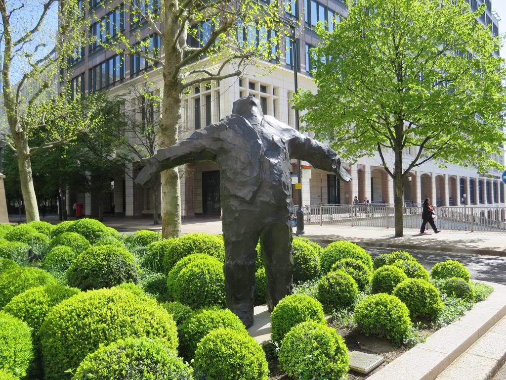
He did. He told me that maintenance staff employed at the Wharf could be ‘let go’ for the most trivial reasons, and if someone from Canary Wharf Management were to see my photo on Instagram or wherever, he would most likely be tracked down and given his P45.
Ice cream vans
Independent shops
Jams, traffic
John Lewis. There’s a Waitrose that looks like a John Lewis and sells John Lewis-type merchandise, but it’s called Waitrose. Nobody knows why
Just passing through’. No one does this. Canary Wharf isn’t on the way to anywhere
Kebab shops
Knocking shops. Not that I’ve seen, anyway. Not that I’ve been looking. Or know what one looks like. If they look like office receptions I may have to revisit this entry
Learner drivers
Listed buildings
Litter
Long grass. Like long hair, it’s redolent of anarchy and will not be tolerated. There are little parks and gardens in Canary Wharf but they are enthusiastically maintained, with all the plants laid out in regimented rows and patterns
Marks & Spencer. OK, there is one that does a roaring trade in food. But one where you can buy some socks? Forget it
Men in suits. Joking!
Old people. Older than me people, definitely
Patience at pelican crossings. This particular phenomenon isn’t restricted to Canary Wharf but its effect is more pronounced here due to the lack of heavy traffic. What happens is that a pedestrian will hit the pelican crossing button before looking to see if any traffic’s coming or not. It’s generally not, so he’ll stride straight out into a deserted road. Then, when a car finally does show up, the lights will suddenly turn red for no reason. This makes me angry as a driver and a pedestrian. Even if I were a pelican I’d be furious
Pelicans
Petrol stations
Pigeons. Today I was wondering why you didn’t see that many pigeons in Canary Wharf when I came face to face with one of the reasons. Lemmy is a Harris Hawk who, his handler explained, is employed to persuade pigeons and gulls that they would lead more fruitful lives in other London boroughs. ‘But there aren’t many pigeons around here!’ I said. ‘I know,’ replied Lemmy’s boss. ‘He’s good, isn’t he?’

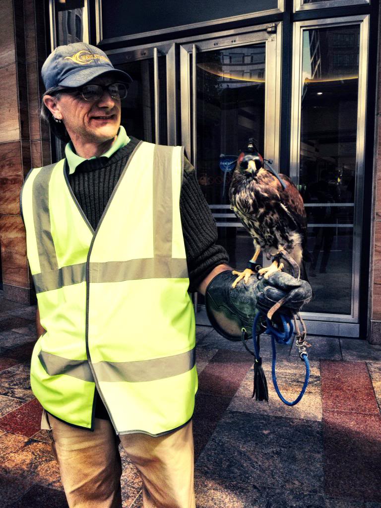
That’s Lemmy on the right

Police. Proper police. The ones at Canary Wharf may look like your regular plod, but in fact they’re a private force. You see them every hundred metres or so, standing around or walking along with varying degrees of purposefulness. They look well tooled up but they’re mostly packing torches, walkie-talkies and energy bars. Truth is, there’s not much for them to do around here and in any case they have very limited powers. Most of the crime at Canary Wharf occurs behind glass doors*, and it’s unlikely these uniformed plastics have the authority to barge in and say ‘Right, you’re all nicked!’ ‘What’s the charge, copper?’ ‘We’ll think of something, sunshine. How about complicity in acts of financial malpractice likely to engender global recession? And that’s just for starters!’
Poundland, Primark, public libraries, pubs with dartboards
Quitters. There’s no place in Canary Wharf for people who aren’t in it to win it. You snooze, you lose. It’s our way or the dual carriageway
Quizzes, pub
Ram-raiders. The office blocks around the wharf are protected by tank-proof obstructions, often disguised as flower boxes. With its all-pervasive air of paranoia, Canary Wharf is the Porton Down of the business world. Mind you, the IRA did plant a massive bomb here back in 1996, so the fear isn’t completely unfounded
Scruffy people. If you do happen to see a girl in ripped jeans, they’ll have been skilfully hand-ripped by a professional jean ripper
Skateboarders, although you do see the occasional spirit-crushing sight of a middle-aged office worker on a scooter
Tattoo parlours. Are you kidding?
To Let’ signs on empty offices. Sends out the wrong signal
Toy shops
Tripods, Photographers with. Hat tip to Rob Borgars for this observation. Basically, using a tripod is discouraged in the Wharf. The reasons? You could be a terrorist (no, I can’t see the connection either). You might cause someone to trip, resulting in legal action. Or you might be someone aiming to take a photograph for commercial gain. Tripod = professional, you see.
Undertakers
Urban foxes. I’ve never seen a squirrel here, either
Unseemly free-for-all to get on the Tube at the end of the day. Instead, Canary Wharfers (as nobody calls them) queue in an orderly fashion. It’s a sight to behold
Vandalism
WH Smith. Oddly, there isn’t a single branch of Britain’s favourite newsagent. Something called ‘News on the Wharf’ takes care of all the fags ‘n’ mags stuff
Xylophones. No one I’ve spoken to has ever seen one in Canary Wharf. Nor have there been any sightings of marimbas, glockenspiels, vibraphones or thongophones. Things might be different if there was a music shop here
Yobbos. Yodellers. Yellow-crowned night herons. I’m struggling with Y
Zombies. None of the office grunts or ‘retail sales advisers’ are flesh-eating zombies. I’m pretty certain about this.

*Probably

Anything I’ve missed?  Do let me know. Also if the local M&S has started selling socks yet. (Update: they always have.)

7 Comments

Filed under London learnings, Stuff

How to ruin an ad

We are deep into the 1980s and advertising agency de jour Collett Dickenson Pearce (CDP) has just presented its solution to the latest brief from its client, Parker Pens. Like previous executions in a long-running campaign, the ad takes the form a 48-sheet poster.

This ad features a pen that, unusually in an era of shiny silver and gold pens, is finished in matt black.

The poster ticks all the right boxes. Just seven words, lots of standout, nice pack shot, and a headline that completely wrong-foots the reader. You’re expecting it to say ‘clever’ or ‘smart’ or ‘gorgeous’; anything but ‘dull’. By confounding our expectations, the ad encourages you to look at the image, reread the headline, complete the equation ‘dull = not shiny’, then study the caption and make a mental note to try the pen out next time you’re in Smiths. Job done.

The client loved the ad and ran it. It picked up a few awards and probably shifted loads of pens.

The following is what could have happened had the Parker client been one of those people who likes to ‘improve’ ads.

And what could have happened had the agency been one of those that doesn’t stick to its guns…

“I like it,” says the client, ‘but I’ve seen research stating that people don’t like negatives in ads. Can we turn the headline round and make it a bit more positive?”

“Sure”, says the account director. “I’ll get the creatives straight onto it.”

“Much better,” says the client. “Very strong. But I’ve been discussing the ad with my team and some very good points were raised.

“The advert doesn’t make any mention of price. The pen you’ve chosen is quite expensive, so I was wondering if the ad could reflect the fact that Parker make a range of pens. You know, to suit every budget. We don’t want people to think we only make pricey pens!

“Also, and this is probably my mistake, I neglected to mention the matching presentation case the Parker 25 set actually comes in. And the guys in Brand went ape about the lack of a logo! Can you add the logo, and our Royal Warrant?

“Oh, and we’re in October now. People will be thinking about Christmas. Could you just add a nudge in that direction? Thanks”

“No problem,” says the account director.

“Brilliant! You guys rock. And that’s so true, about Christmas and Parker. Well done.

“You know, I was wondering if we could perhaps capitalise on that whole Christmas giving thing? I only ask because Parker offers an engraving service. That would be such a neat idea at this time of year. Plus I went on this advertising course where they kept going on about how the ‘offer is king’. So let’s just push this engraving idea, shall we?

“Otherwise it’s fine. Although we could perhaps big up Parker a bit. They don’t throw out these royal warrants willy-nilly, you know. We shouldn’t undersell ourselves.”

“Of course not,” says the account man. “I’ll see what the studio boys can rustle up.”

“Perfect. Looks like you’ve got everything in there.”

*reads for several minutes*

“Good. Very good. Although…”

“Yes?”

“Well, I showed the previous ad to Mrs Client, and she pointed out that it didn’t really shout ‘Christmas’ enough. Could you just make this one a tad more seasonal, do you think? Then we’re just about there, I reckon.

“Oh, and following on from that ‘the offer is always king’ thing I was telling you about, I had a bit of a brainwave about how we could drive sales by offering another of our products at the same time. It’s all about driving sales at the end of the day, isn’t it?”

“Ha ha ha, of course it is. I’ll ask the studio…”

“And the pens look a bit all over the place. It’s not immediately apparent who they’re aimed at. Could you group them according to whether they’re male or female pens?”

“A fantastic suggestion! I’m on the case.”

“We’re getting there. We’re certainly getting there.”

“That’s great news. I’ll…”

“Although, looking at it, there is rather a lot to take in, isn’t there?”

“Eh?”

“For a poster. Aren’t they supposed to have a maximum of eight words or something? That’s what you told me, I distinctly remember. You’re ignoring your own advice!”

“But…”

“Don’t worry. I have a solution. Instead of a poster, make it a press ad. That way you can get in a few more sales points. And a list of dealers. I know! Duh! Let’s make it a direct response ad and sell pens off the page! You know, I think we’re going to end up with something really quite different.”

“Yes, I think you might be right.”

“Brilliant! Anyway, must dash. I’ve heard a rumour that our share price is slipping…”

About this article

I found this piece in a very old edition of Creative Review. Although when I found it, it was called ‘the latest edition of Creative Review’.

I kept the magazine because I thought the piece was a funny and telling demonstration of many truths. How ideas are precious things, how the desire to ‘improve’ an idea is part of many people’s make-up, and how a willingness to please (or appease) a client can result in poorer and less effective work.

I lent the magazine to a creative director who thought it would be good for a talk he was delivering on the subject, and that was the last I saw of it. However, he had kept the visual elements of the piece, and these he kindly emailed to me. Unfortunately I don’t remember the author of the text that originally accompanied the visuals – I think it might have been the ex-CD of CDP, John O’Donnell. I hope my words have maintained the spirit and, hopefully, some of the wit of the original.

Resources

A (relatively recent) history of the Parker Pen Co, Wikipedia’s entry on Collett Dickenson Pearce, and some of their ads

Text © Kevin Mills 2013

14 Comments

Filed under Ill-informed advertising observations

Those allegations. Do you deny, dispute, refute, rebut or contest them?

From (allegedly) kiddie-fiddling cardinals to (so they say) overly-lascivious Lib Dem leaders,  allegations of inappropriate behaviour are everywhere these days.

Leaving aside whether the use of that word ‘inappropriate’ is appropriate in these cases (is it really being too judgmental to take the view that abusing children is ‘wrong’ rather than merely ‘inappropriate’?), the allegations are generally followed by a denial of any wrongdoing.

However, a common-or-garden denial is somehow seen as insufficient. So the accused party will instead say he refutes the charges, presumably because it sounds like a more robust kind of denial. Sometimes they’re reported to be ‘contesting’ the accusations, or alternatively they might ‘dispute that version of events’. A ‘rebuttal’ of child-sex allegations is heard less often, perhaps because the word sits rather awkwardly with that particular offence. As does ‘sits rather awkwardly’. But shush.

The question is, if you’re a copywriter who’s been accused of something untoward, just what type of denial should you hit back with? Here’s your handy at-a-glance, cut-out-and-keep guide:

“You’ve been in the pub!”
A straightforward denial should be enough to counter this outrageous slur, provided you don’t allow your accuser to get close enough to smell your breath, or mangle your words to the extent that your very denial becomes an outrageous slur.

“Your copy is off brief!”
This is one you can refute, because to refute something is generally held to mean disproving it through evidence.  So you simply hold the creative brief up in triumph and say “See? You specifically asked for the copy to focus on the kill-rate of the MP7 Sub-Machine Gun, and for the tone to be light and whimsical!”

“You’ve lifted this copy!”
You can either deny or dispute this accusation, although disputing it suggests it contains at least a kernel of truth that warrants  argument and debate. Better to deny it outright, at least until your accuser comes back with the proof. Then you’re on your own.

“Your copy didn’t generate a response”
You can rebut this criticism simply by providing a sheaf of the responses your ad did get, taking care not to mention that 90% of them were complaints about tone, veracity or plagiarism (see above).  Rebut, then, is similar to refute, although back in the 90s New Labour was famous for its effective ‘rapid rebuttal unit’ (strapline: ‘Yeah but, no but, REBUT!’) rather than a ‘rapid refutation unit’. That would have been silly.

“You totally lost it with the client when he rejected all your perfectly reasonable ideas, telling him he had the imagination of a small stick before pouring coffee over his head.”
Up to you. If it didn’t happen, deny it. If you can produce a happy, smiling client, refute it. If it was tea not coffee, dispute ‘that particular version of events’. But if the accusation is that it was your art director who carried out the assault rather than you, you should take legal advice and contest it.

All clear?

6 Comments

Filed under Stuff

You want hard-working advertising words. That’s why we’ve identified two more.

I say ‘we’, because I wasn’t alone in spotting this comparatively recent trend. The estimable Tom Albrighton over on ABC Copywriting did all the heavy lifting back in May. Quick on his feet, that Tom. All I’m bringing to the table is a few more examples.

I’m talking about the ubiquity of the two words ‘that’s why’ in advertising copy. As Tom says, it follows the formula:

At A, we know how important B is. That’s why we C, which gives you D.

Or: You know this? That’s why we have this

It’s cropping up everywhere. It’s like every copywriter in town has been on the same course. Which would be strange, because copywriters don’t go on courses.

Here’s a few examples I’ve half-heartedly collected over the past two weeks. There are loads more out there.

'Find healthy'? Let's not go there.

One ad. Three that's-whys.

Oh, so that's why!

This is a bit of a non-sequitur, in my opinion.

Basically, we wanted to increase profits and hurt the competition. That's why we were compelled to make our products look and sound desirable. Otherwise we'd have just thrown together the first thing our designers came up with.

It's Sidney again, still looking for healthy. Hang on, wasn't he 88 in the previous ad? Time flies when you get old. (That's why you should try and enjoy every day as if it were your last.)

Cheerio!

6 Comments

Filed under Ill-informed advertising observations

Ads from 21 years ago

At precisely 9.44pm on a hot and humid July 30th 1990, Georgia Mills took her first lungfuls of air in a maternity suite at St George’s Hospital, south London. Over the course of that busy weekend I made frequent trips to and from the hospital, was on the phone virtually non-stop and generally performed lots of new-dad duties.

I also found time to do something a bit unusual. I taped the day’s news onto the VHS recorder and gathered up a selection of Saturday’s newspapers. Then I stuffed them all into a thick black plastic bag, the kind photographers keep light-sensitive paper in, stuck a label on it saying ‘Do not open until 31st July 2011’, and hauled it up into the loft.

Fast forward to last Saturday evening and I’m in the garden with Georgia, her mum and younger sister. It’s Georgia’s 21st birthday and we’re drinking champagne while she opens cards and presents. Eventually she gets to the black bag and we all have a chance to peruse the contents.

There’s a Guardian, a Daily Star, a Daily Telegraph, an Express, Mirror and Sun. There’s also the VHS cassette and – I’d forgotten about this touch – all the congratulatory cards we’d received from friends, relatives and neighbours.

Had Georgia been born a few hours later the papers would have been of greater historical significance as they would have been full of Iraq’s invasion of Kuwait, which kicked off the first Gulf War. As it was, the two parties were still having talks in Saudi Arabia aimed as resolving their crisis. This news occupied one column inch in the broadsheets (my, were they broad).

The main news in most of the papers was the peaceful resolution of a siege in  London’s ‘Tokyo Joe’ nightclub, although the Guardian went for ‘Trinidad gripped by chaos’.

I’m interested in this sort of stuff from a historical perspective. I especially enjoy reading the adverts. They’re a window into a world that can be strangely reassuring and utterly alien. Here’s a small selection, together with the front page of the Telegraph.

As a radio news bulletin, the front page alone would occupy more than 20 minutes of airtime.

Retro's nothing new, you know. Here's a retro ad for a fax machine, which is pleasingly ironic.

A rare colour ad. For £5,995 you got a stereo radio/cassette and 'special 'jazz' graphics'.

After 21 years, this is still very recognisably an ad for First Direct.

Whatever happened to Metro? Or Rover? Or the team responsible for this confection?

All that speed! All that power! To think, today's socks have about as much computing power

Finally, an ad from 1990 that you could easily run today without changing much.

10 Comments

Filed under Anecdotage, Ill-informed advertising observations

We provide our own emphasis

One of things I don’t like about the Daily Mail – apart from the misogyny, the homophobia, the jingoism and racial intolerance, the bile, spite and malevolence, the rejection of anything new or different, the small-mindedness, the crass populism and the utter, utter hypocrisy – is the underlinings.

They turn up in headlines like this:

‘So, who has got the fattest legs in showbiz?’

‘It’s official: immigrants do come from overseas’

‘How faceless Brussels Eurocrats plan to steal our children’s faces’

The sub-editors use these underlinings literally to underline the DM’s agenda. Each one says “You know those prejudices you’ve got? Well they’re well-founded. You’re not racist or irrational. Those dark thoughts and fears you harbour are in fact completely normal. Everything’s alright with your head. You’re amongst friends here. We’re like peas in a pod, you and I. And there’s nothing wrong with good old British peas, unlike swarthy, swan-eating foreign peas.”

Underlinings are ubiquitous in advertising copy, too, though their presence is driven by commercial rather than ideological reasons. “Can you just emphasise the price?” asks the client. “The price is a big selling point. And the phone number, can you put that in bold, along with the web address, and make sure they’re mentioned up front. And somehow draw attention to the ‘offer closes’ date. Oh, and underline the free set of steak knives. In fact, could you emphasise everything and makes sure it all gets mentioned first?”

Copywriters generally end up accommodating at least some of the clients’ wishes because, well, we like to eat. The result, though, is all too often deeply unattractive ads and, worse, a patronising shoutiness that doesn’t trust people to read the ad ‘properly’.

I challenge you to check out the current top 10 titles on the Amazon best-selling fiction list and find any examples of underlining, emboldening or italicising used as a means of emphasis. OK, the literature vs advert comparison is slightly disingenuous. Books want you to get involved; ads want you to get online, get on the phone or get down the shops.

Occasionally, I suppose, the way to get people to do that is to yell and hector them. After all, the market stallholder doesn’t outsell his rivals by adopting a Sergeant Wilson-style sales patter: “I say, would you mind awfully looking at the rather generous price of my splendid tomatoes? In your own time.”

But not all ads need to shout and nor do they have to tell you how to read the copy. If it’s expressed well, the voice in your head can detect the importance of a message or the uniqueness of a proposition. It knows when to invest copy with whimsy, breathlessness, charm or urgency. It can also tell when a word needs emphasis.

I was reminded of this the other day after reading that the Metropolitan Police were introducing a new ‘101’ number for non-emergency calls. Presumably this will replace the distinctly unmemorable number they launched a few years back with the same purpose in mind. But I kept the little door-drop because I liked the way it allowed people to provide their own emphasis:

Admit it: your inner voice put an inflection on ‘has’, didn’t it? Then you read it again and emphasised both ‘is and ‘has’. See? I rest my case.

9 Comments

Filed under Ill-informed advertising observations, Stuff